Project 3: Brexit Analysis

Task 3: Brexit vote analysis
We will have a look at the results of the 2016 Brexit vote in the UK. First we read the data using read_csv() and have a quick glimpse at the data
# read data directly off github repo
brexit_results <- read_csv("https://raw.githubusercontent.com/kostis-christodoulou/am01/master/data/brexit_results.csv")


glimpse(brexit_results)
## Rows: 632
## Columns: 11
## $ Seat <chr> "Aldershot", "Aldridge-Brownhills", "Altrincham and Sale W…
## $ con_2015 <dbl> 50.592, 52.050, 52.994, 43.979, 60.788, 22.418, 52.454, 22…
## $ lab_2015 <dbl> 18.333, 22.369, 26.686, 34.781, 11.197, 41.022, 18.441, 49…
## $ ld_2015 <dbl> 8.824, 3.367, 8.383, 2.975, 7.192, 14.828, 5.984, 2.423, 1…
## $ ukip_2015 <dbl> 17.867, 19.624, 8.011, 15.887, 14.438, 21.409, 18.821, 21.…
## $ leave_share <dbl> 57.89777, 67.79635, 38.58780, 65.29912, 49.70111, 70.47289…
## $ born_in_uk <dbl> 83.10464, 96.12207, 90.48566, 97.30437, 93.33793, 96.96214…
## $ male <dbl> 49.89896, 48.92951, 48.90621, 49.21657, 48.00189, 49.17185…
## $ unemployed <dbl> 3.637000, 4.553607, 3.039963, 4.261173, 2.468100, 4.742731…
## $ degree <dbl> 13.870661, 9.974114, 28.600135, 9.336294, 18.775591, 6.085…
## $ age_18to24 <dbl> 9.406093, 7.325850, 6.437453, 7.747801, 5.734730, 8.209863…The data comes from Elliott Morris, who cleaned it and made it available through his DataCamp class on analysing election and polling data in R.
Our main outcome variable (or y) is leave_share, which is the percent of votes cast in favour of Brexit, or leaving the EU. Each row is a UK parliament constituency.
To get a sense of the spread, or distribution, of the data, we can plot a histogram, a density plot, and the empirical cumulative distribution function of the leave % in all constituencies.
# histogram
ggplot(brexit_results, aes(x = leave_share)) +
  geom_histogram(binwidth = 2.5)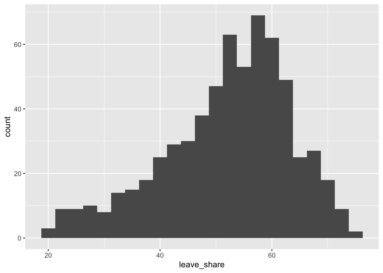
# density plot-- think smoothed histogram
ggplot(brexit_results, aes(x = leave_share)) +
  geom_density()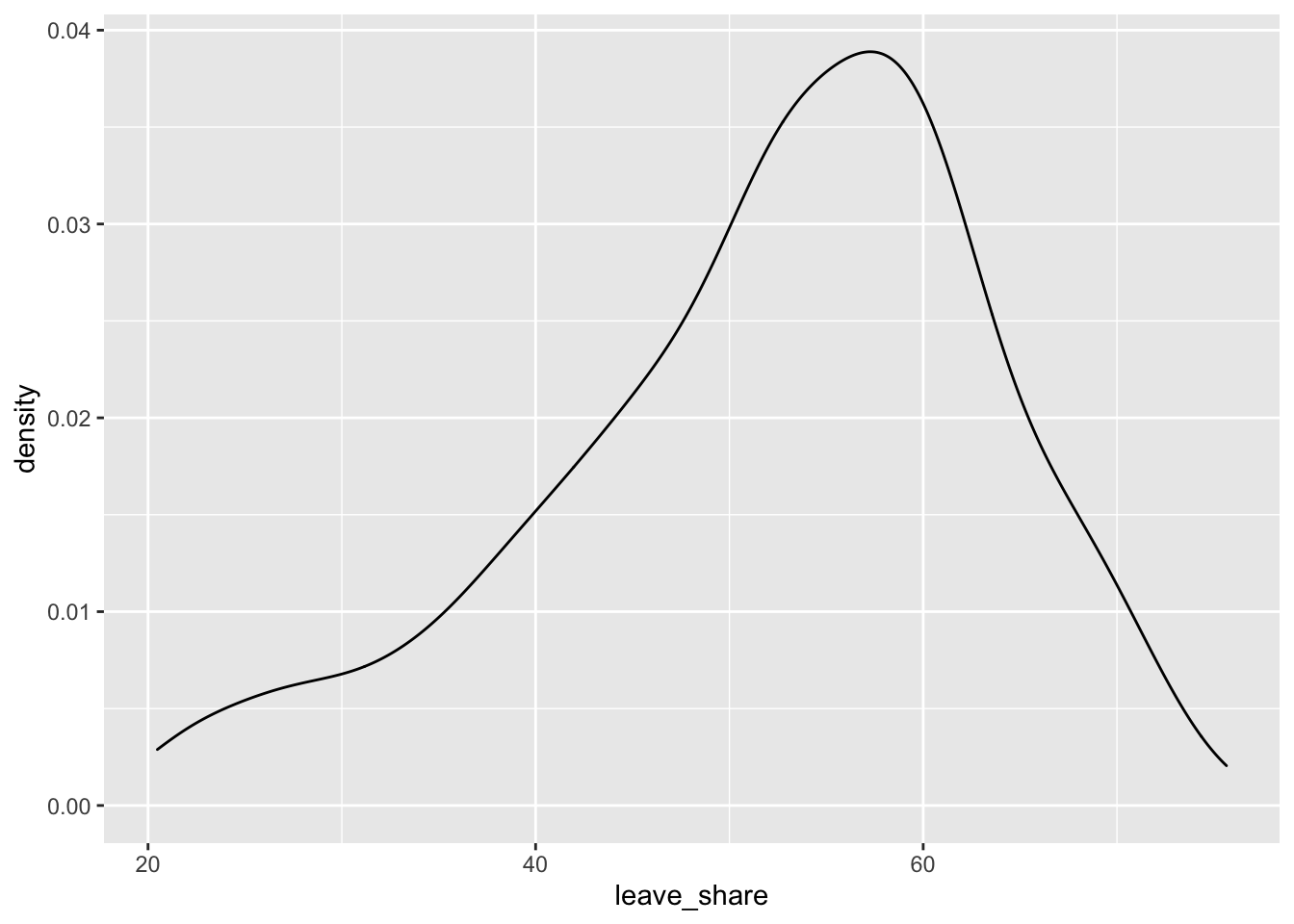
# The empirical cumulative distribution function (ECDF)
ggplot(brexit_results, aes(x = leave_share)) +
  stat_ecdf(geom = "step", pad = FALSE) +
  scale_y_continuous(labels = scales::percent)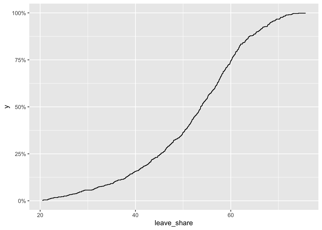
One common explanation for the Brexit outcome was fear of immigration and opposition to the EU’s more open border policy. We can check the relationship (or correlation) between the proportion of native born residents (born_in_uk) in a constituency and its leave_share. To do this, let us get the correlation between the two variables
brexit_results %>%
  select(leave_share, born_in_uk) %>%
  cor()
## leave_share born_in_uk
## leave_share 1.0000000 0.4934295
## born_in_uk 0.4934295 1.0000000The correlation is almost 0.5, which shows that the two variables are positively correlated.
We can also create a scatterplot between these two variables using geom_point. We also add the best fit line, using geom_smooth(method = "lm").
ggplot(brexit_results, aes(x = born_in_uk, y = leave_share)) +
  geom_point(alpha=0.3) +

  # add a smoothing line, and use method="lm" to get the best straight-line
  geom_smooth(method = "lm") +

  # use a white background and frame the plot with a black box
  theme_bw() +
  NULL
## `geom_smooth()` using formula 'y ~ x'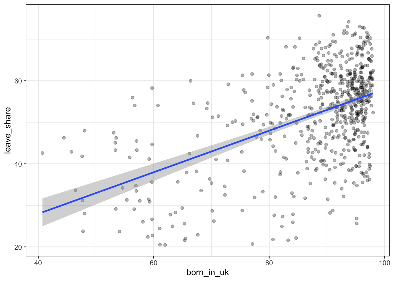
You have the code for the plots, I would like you to revisit all of them and use the labs() function to add an informative title, subtitle, and axes titles to all plots.
What can you say about the relationship shown above? Again, don’t just say what’s happening in the graph. Tell some sort of story and speculate about the differences in the patterns.
Type your answer after, and outside, this blockquote.
We can clearly see that there is a clear relationship between the share of residents that are born in the UK and the respective percentage voting for leave.
There might be multiple reasons for this: First, regions with a high share of people born in the UK might not have interacted a lot with people with different cultural backgrounds. To me, it is intuitively true that interacting with people from different cultures reduces prejudices people have. I assume that prejudices played a crucial role in this vote and this is one inference that can be drawn from this graph.
Second, I think that people that are not born in the UK might not be as interested in leaving the EU because they might have families in other European countries. Those people might be interested in visiting their families without having to apply for a visa or being apple to rejoin with their families. This might be another reason.